A shop that reflects the brand's quality
- Shopify Plus
- B2B & B2C
- Launch
- UX/UI Design
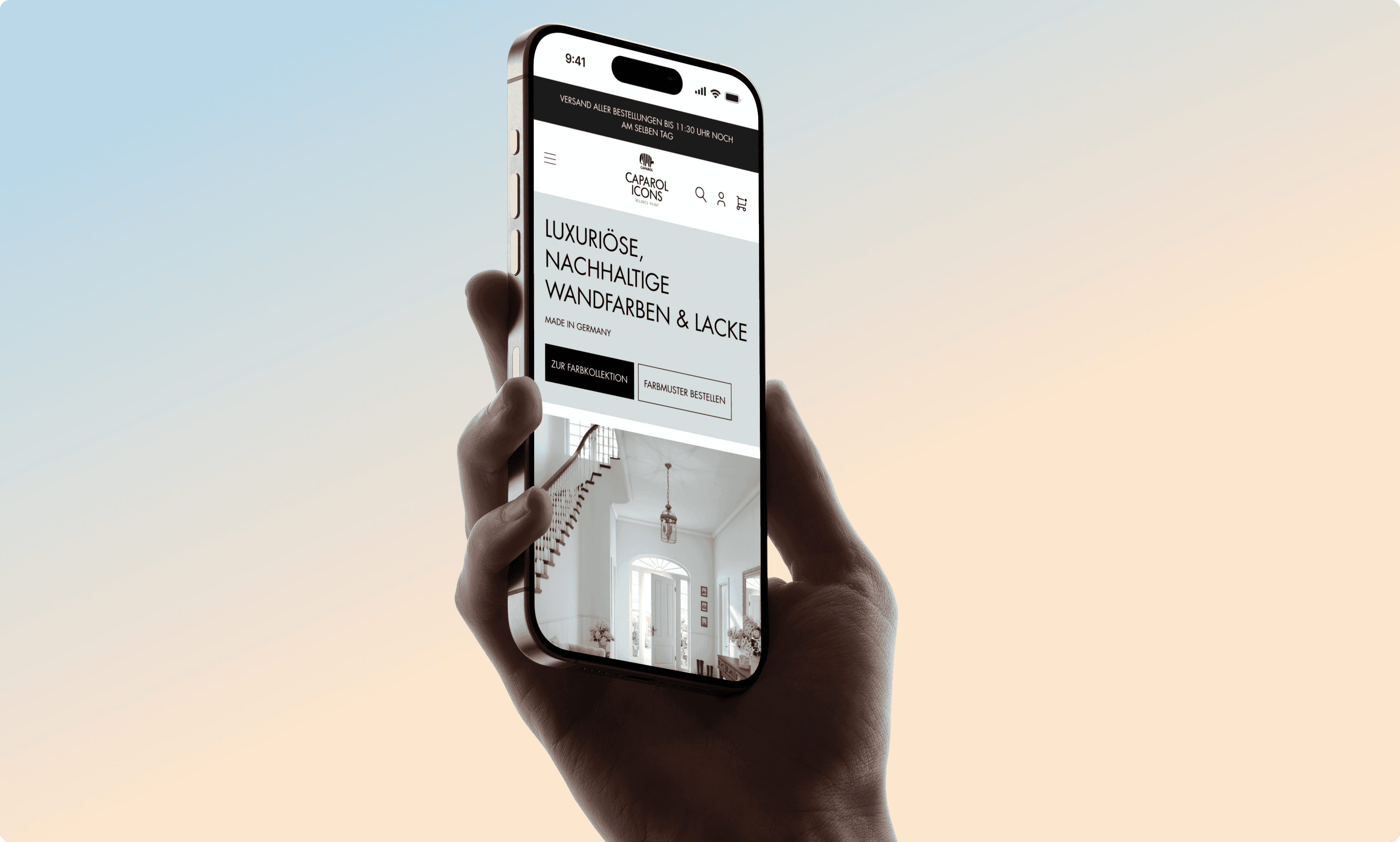
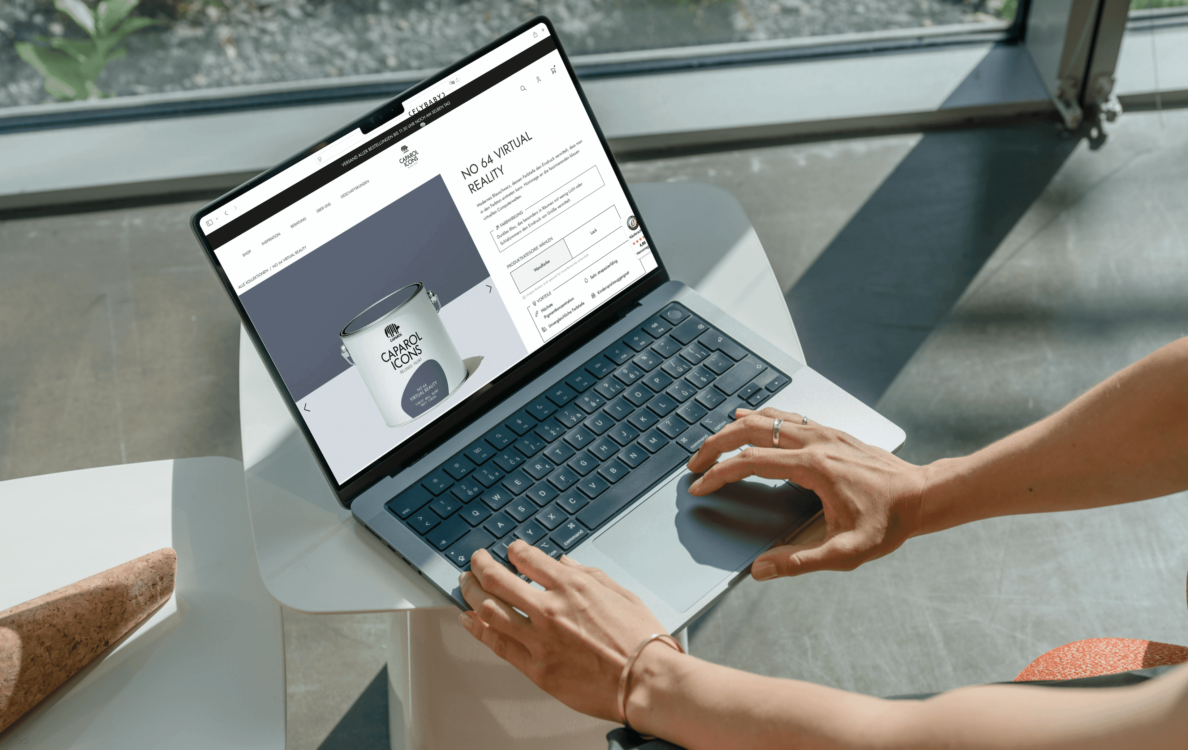
Caparol Icons stands for paints in the premium segment. Together, we are continuously developing the shop further:
from navigation and product pages to the launch of the B2B shop.
Premium brand. Growing demands.
Caparol Icons already had everything a successful premium brand needs: high-quality products, a clear positioning, a loyal customer base, and an established shop as a solid foundation.
As the brand grew, so did the demands on the digital experience. Instead of rebuilding the shop from scratch, we built upon the existing theme and fundamentally developed it further at the core areas.
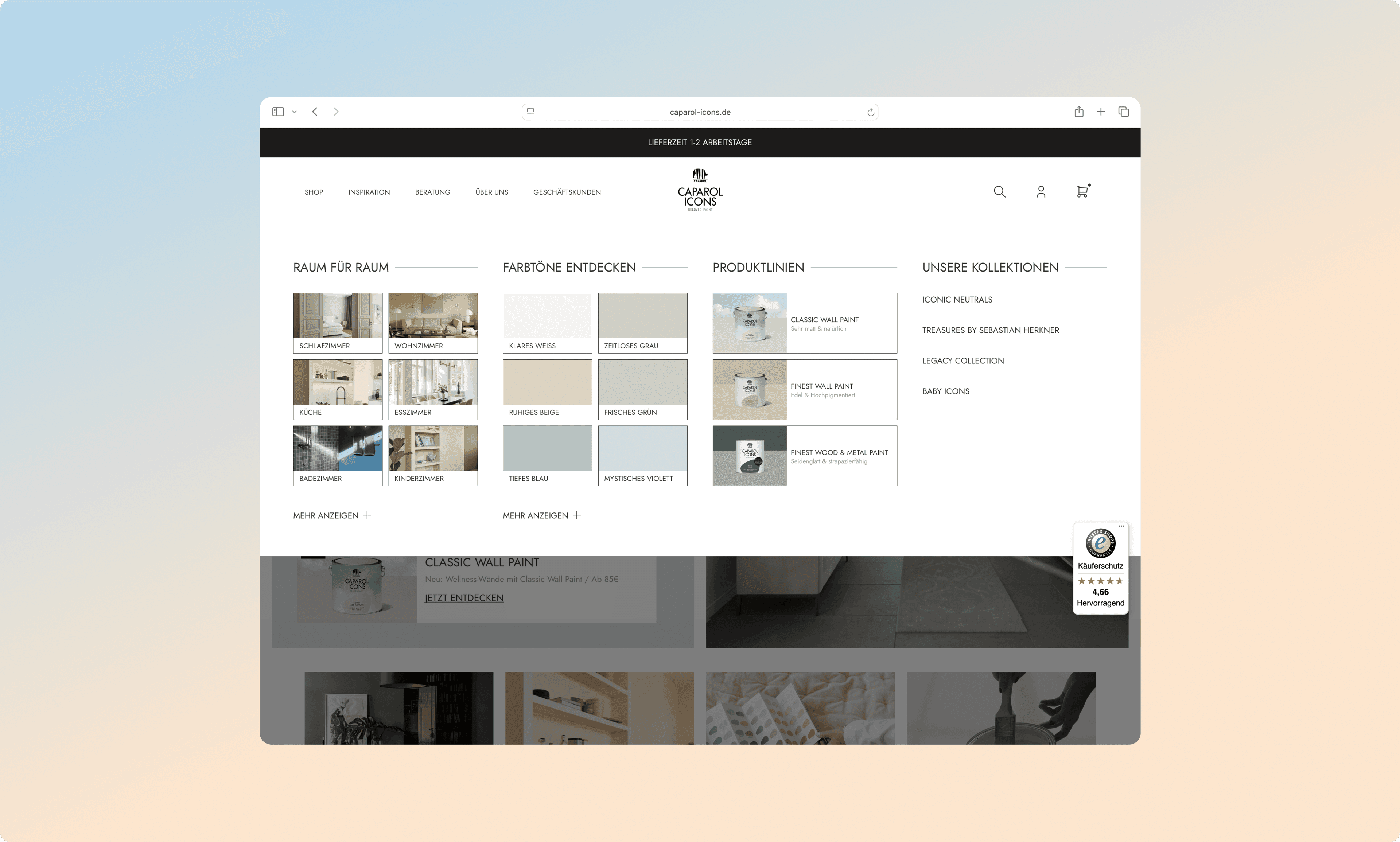
 Over the years, the navigation and shop structure had grown and needed to be made easier for visitors to navigate.
 Private and business customers needed their own entry points tailored to them.
 The product pages should convey the unique features of the products even more clearly.
 The digital experience should consistently convey the brand's premium standard.
More orientation.
More clarity.
More brand.
Instead of reinventing the wheel, we used the existing theme as a foundation and redesigned the user journey at key points. The goal: to guide customers to the right products more quickly and to make the Caparol Icons brand world more tangible.

Further development on existing basis
Instead of starting from scratch, we fundamentally redesigned the existing theme in key areas. This keeps investment focused and makes improvements quickly visible without a months-long relaunch phase.

New navigation system
A modern navigation system simplifies categories and entry points. Visitors understand more quickly which products are suitable for their project, whether it's a living room wall or a commercial project.

Filtering for product search
A new filter helps to narrow down the collection in a targeted manner, for example by [color shade, area of application, surface]. This turns a large selection into a quick decision.

New elements for homepage & sections
We have developed new, modular elements for the homepage and central shop areas. This allows collections, novelties, and inspirations to be presented in line with the brand and featured flexibly.
Launch of the B2B shop
Business customers have their own requirements regarding product range, pricing, and processes. We supported Caparol Icons during the launch of their B2B shop to ensure both target groups receive an experience tailored to them.
Product pages focused on purchasing decisions
The new product pages clearly present relevant information, areas of application, and product advantages. This facilitates orientation and builds trust in the purchasing decision.
Book your 30-minute initial consultation now.
The first step to more growth
“Planning a relaunch, or is your store not growing as planned? Book a slot – we’ll take a look and figure out whether we can help.” – Eric Schlottke, Co-Founder muun